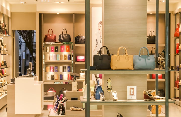
When walking around a store, what are your first thoughts? Maybe, “ooh, I love that!” or “yikes! That’s expensive!” or maybe it’s “don’t I already own something like that?” It is never “wow! What a cool display! This store really succeeds at visual merchandising!” For those who don’t know, visual merchandising is the arrangement of merchandise in a store—this ranges from determining the fixtures, which merchandise they will hold, and their placement within the store. Oftentimes, visual merchandising is depicted as only dealing with window displays. It’s important to realize that it encompasses various components of the arrangement and placement of products (and non-products) within stores.
This past summer I had the amazing opportunity to intern in the visual merchandising department at Lands’ End’s corporate headquarters. I spent my days working in a visual laboratory (which was actually just a renovated Walmart) creating floor sets for the upcoming seasons. It was by no means glamorous, as working in fashion often is depicted as; most days I was standing on top of scary-high ladders, assembling shelving units, and steaming mannequins. This experience gave me a newfound appreciation for visual merchandising. Sure, we see amazing and innovative window displays all the time, but do we ever stop to realize and appreciate all the detail that went into that? To show you just some of the detail that goes into visual merchandising, here are some of my favorite displays:

