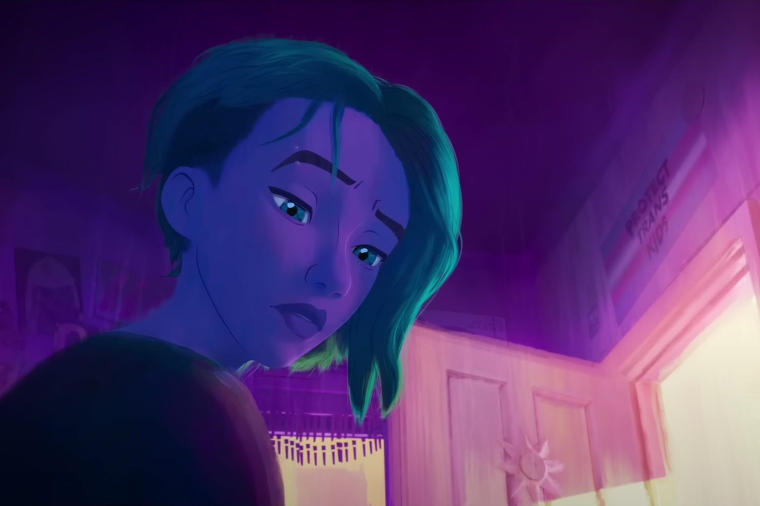
When I first went to the theatre to see Into the Spider-Verse in 2018, it blew me away. I was enamoured by the story and characters, which are both incredible, but it was the visuals that really caught my attention.
Joaquim Dos Santos, one of the directors of Across the Spider-Verse, says to Variety, “There was a before ‘Spider-Man: Into the Spider-Verse’ time and an after ‘Spider-Verse’ time with regards to feature animation. And when that film landed, it planted a flag.” So, what gave Spider-Verse that edge, and how have these movies changed the game for feature animated films?
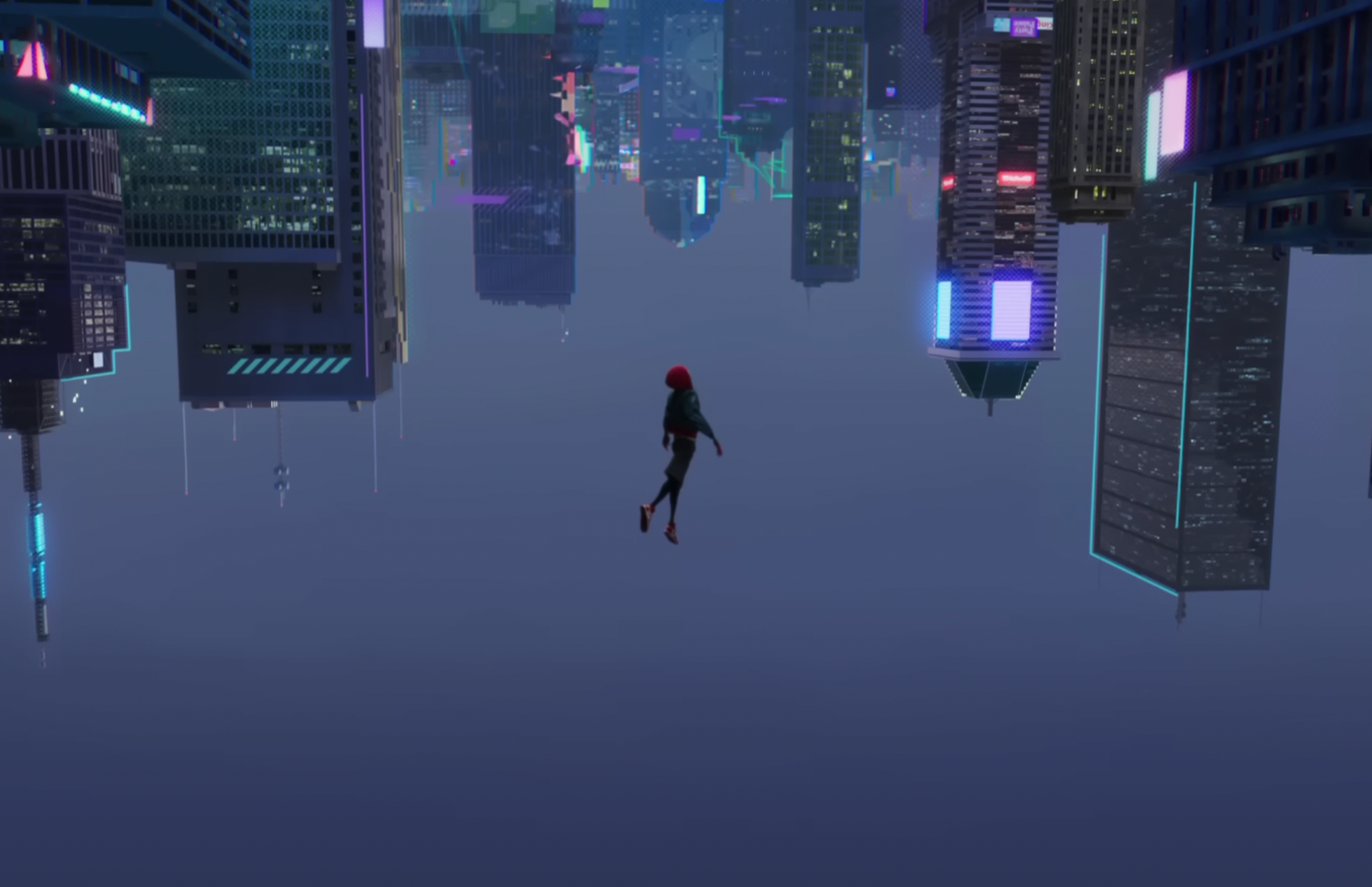
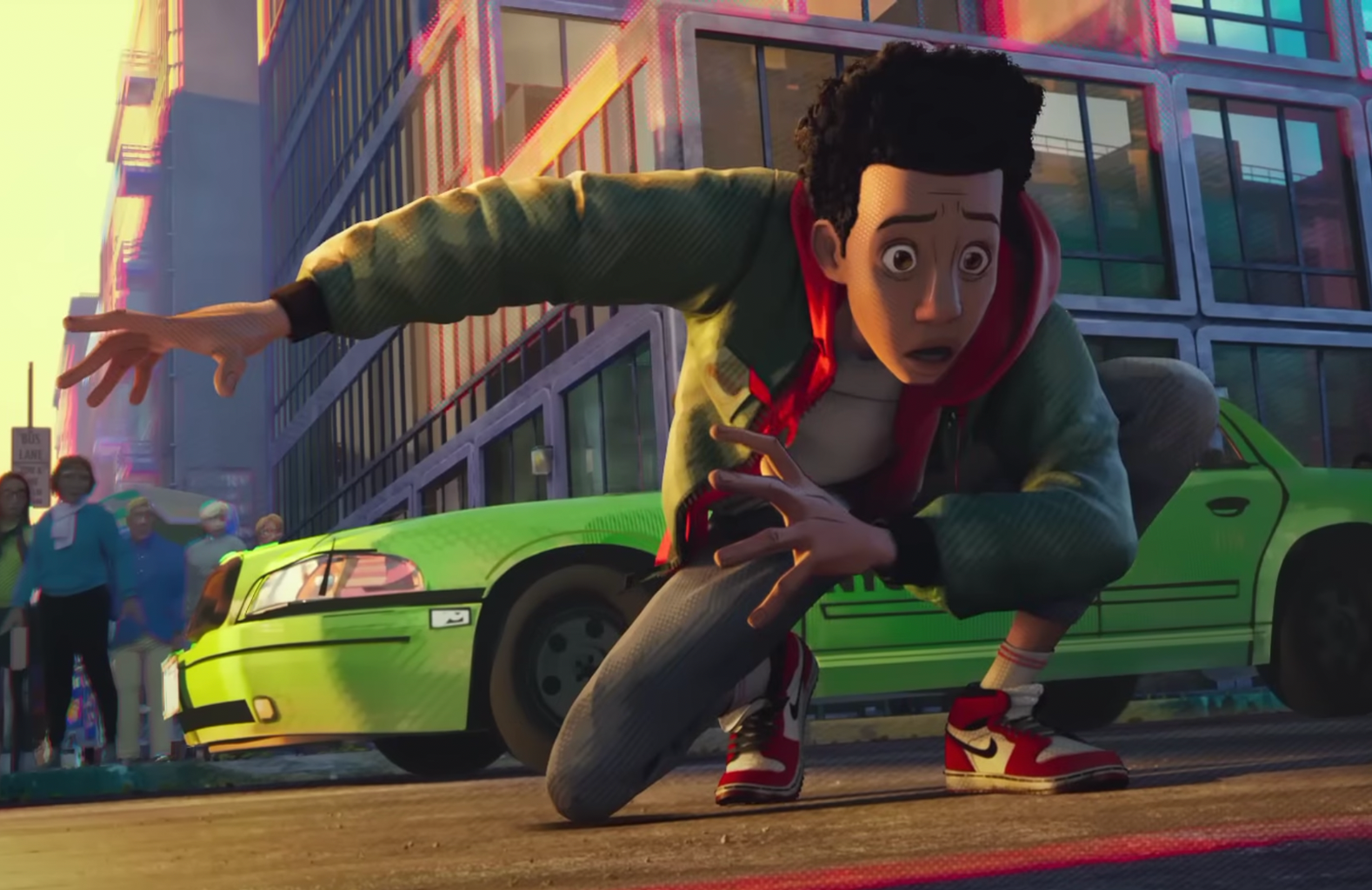
A New York Times article attributes the impact of Into the Spider-Verse to its animation style: the film “bucked the trend of modern animation” by taking its style directly from the comics that inspired it. If you’ve seen the movie, you know what that means — Into the Spider-Verse is full of nods to the comic style, from captions to multiple panels to the visual texture of the characters and settings. They achieved this by using Ben-Day dots and Kirby dots, which come straight from the comic book origins. One of my favourite sequences from that film is when Miles first begins to discover his new spider powers and — in a nod to the original Spiderman comics — his inner monologue appears in captions above his head. Not only is it hilarious to watch Miles’ inner thoughts go wild as he fails to play dumb to a security guard, falls out a window, and loses a fight to a flock of pigeons, but as we find out later in the scene, the style directly parallels Peter Parker’s discovery of his own powers in the comics. The sequence is a homage to the comics, which further enhances the tribute to Peter Parker’s Spiderman as it introduces Miles Morales.
The first Spider-Verse movie “planted a flag” by doing something visually different with animation. That decision encouraged other major studios to experiment with animation as well. Its success proved that audiences would accept, and even embrace, projects that diverge from the norm of styles like Shrek and Toy Story. As the New York Times article points out, now we have films like The Mitchells vs. The Machines and Nimona and even the 2023 Teenage Mutant Ninja Turtles: Mutant Mayhem, all of which use very different visuals from the traditional style that studios have been sticking to over the past number of years.
Given the monumental shift that Into the Spider-Verse caused with experimentation and creativity in new animated features, it’s clear that the sequel had a lot to live up to. However, the team behind it certainly rose to the challenge, creating new and inventive animation styles that make Across the Spider-Verse an even greater visual masterpiece.
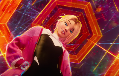
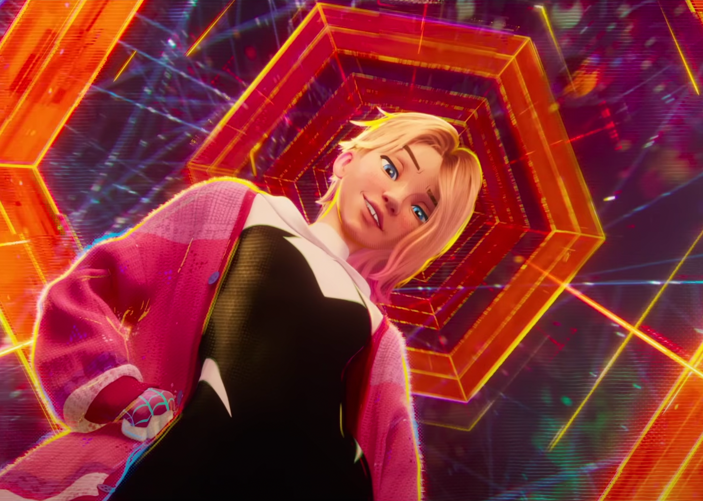
The sequel once again pushes the bounds of animation by employing not just the ground-breaking comic style of the first movie, but by developing six different animation styles to reflect different characters and dimensions. If you’re curious about all of them, check out this Screen Rant article to get an overview of the different styles — my personal favourite is Gwen’s dimension. Gwen’s dimension imitates the Spider-Gwen comics of 2015 by using shifting colours to reflect Gwen’s emotions. When she is arguing with her dad, for example, she is cast in cool blues to contrast the gold sunshine from the window behind him. The colours enhance the distance she feels from her dad, revealing that they are not on the same page. However, a hug between them creates a cloud of pink which warms from their embrace, spreading in a style reminiscent of the watercolour visuals from the comics. As an English major, I’m a huge fan of form following content — when the writing or visual elements of a piece enhance the story that it’s trying to tell. Using colour to signal the characters and their relationships is a really effective tool to convey their emotional states — and it makes for some truly breathtaking visuals.
However, despite these incredible achievements, there was a lot of turmoil behind the scenes. According to this Complex article, over 100 of the artists working on the film left before its completion, citing arduous and unsustainable working conditions as the cause. One of the key problems they listed was that Phil Lord, the producer-writer of the film, continually made revisions to the scenes — which piled onto the animators’ workload so much so that many were extremely overworked, even doing as much as 11 hours a day, all week, for a year of the production.
Given those conditions, it’s unlikely that we’ll see the third installment in 2024. Management will need to provide more mindful organization for the workload, and establish working conditions that are actually sustainable for the talented, brilliant artists involved, all of which takes time. Personally, I won’t mind if they take another four or five years to finish the third film in the trilogy. Their track record of producing creative and visually stunning projects is fantastic, and the team working on it deserves fair treatment.
If the first Spider-Verse movie “planted a flag” and the second stepped up to flex new, inventive creative muscles, I can’t wait to see what the team has in store for Beyond the Spider-Verse. Regardless of when the movie comes out, I will be in the audience!

