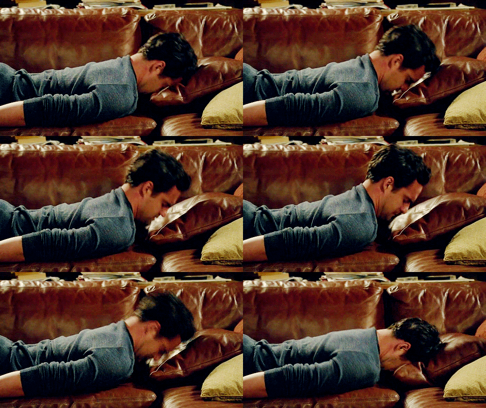
If you love reading romance books as much as I do, then it’s safe to say that a big part of deciding what to read or what book to buy is the cover. Now, I know that the saying goes, “Don’t judge a book by its cover,” which is very true. Some of the best books I’ve read don’t have the best-looking covers (to say the least). But something that I’ve always noticed is that the majority of the romance books I’ve come across follow the same pattern — a shirtless man smack dab on the front cover. As much as I appreciate the eye candy, it gets to a point where it starts to become too much, especially if you read as frequently as I do and want to purchase physical copies for your collection. I’d rather not feel the embarrassment when checking out at Barnes and Noble.
The main argument behind this is that it’s a marketing tactic. The thought process is that seeing a shirtless man on a cover is a good indicator that the story is steamy, and at the end of the day, sex sells. But does it really sell the story? It’s become so overused lately that I purposely turn away from books with these kinds of covers. Most of the time the actual plot doesn’t even include the main guy being shirtless, so what’s the point?
I sometimes use my Twitter account to blog about books I’ve read, so a lot of my followers are avid romance readers as well. I decided to tweet a Google Form survey to ask what their opinions are about this topic. When asked what they thought about having shirtless men on covers, every person was against it. Most responses talked about how tacky it looks, which is why they don’t purchase books with them. Someone else talked about how personally embarrassing it is to own and possibly have friends or family ask them questions about what they are reading. Another response mentions how they feel like someone might see them with it and think they’re reading something NSFW, when they are simply reading an innocent romance novel.
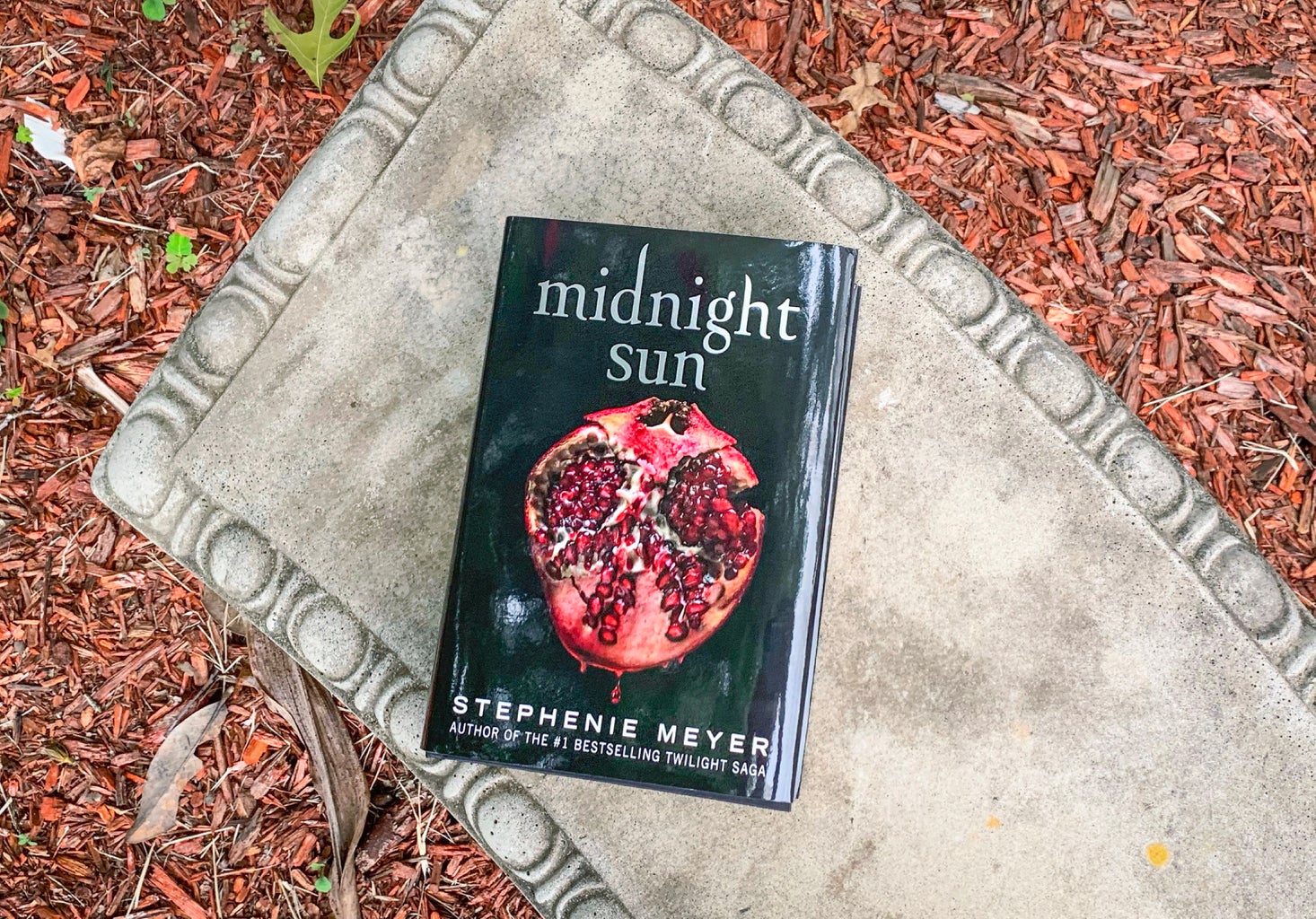
There are many alternatives that readers much rather prefer! I’ve even come across some authors who decide to create “special edition covers” for some of their books that are way more creative than the original cover and sell really well. I personally find that dark, aesthetic-looking covers using props or focusing on the heroine are the most enticing. Having a carefully thought-out cover shows me that the author has focused on all aspects of the book. In the Google survey, when I asked my followers what their favorite kind of cover is, some responses said they like artistic and colorful covers. Others like when covers feature a couple or zones in on their hands or eyes. These alternative options all set a good picture for the story without giving too much away.


